Growing the Kyriakides Brand & Packaging
It all begins with an idea. Maybe you want to launch a business. Maybe you want to turn a hobby into something more. Or maybe you have a creative project to share with the world. Whatever it is, the way you tell your story online can make all the difference.

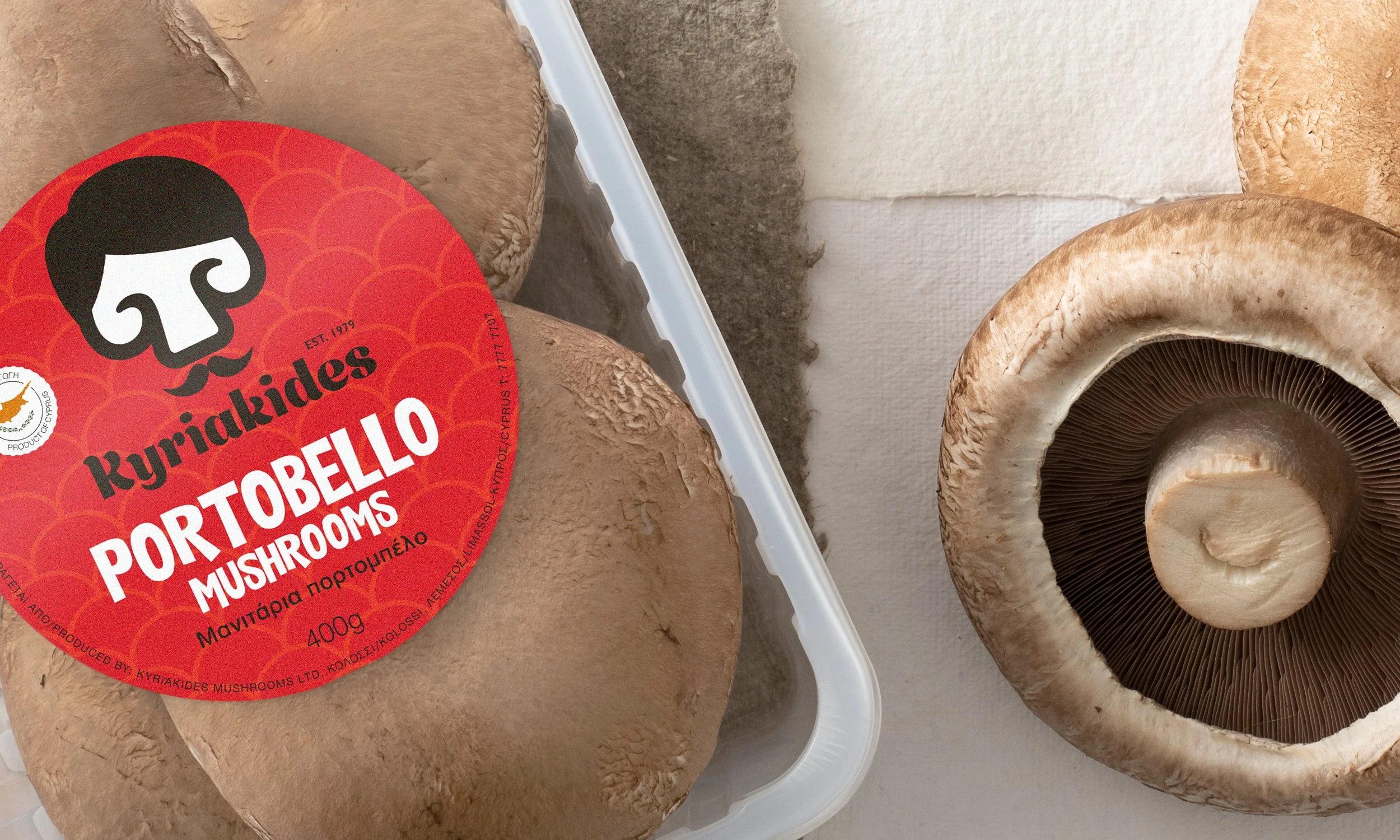
To ensure freshness, the mushrooms are pre-packed
The team
The Kyriakides Mushrooms team is made up of Rissos Kyriakides; the father and his two sons, Nicos and George.
In 1979, Rissos was determined to build the first mushroom farm in Cyprus. He started with just one growing room to produce white mushrooms, at a time when very little was known about mushroom cultivation in Europe. By 2020, they went on to grow 10 different mushroom varieties.
From the first meeting, there was an immediate chemistry with the team; a warm, enthusiastic and forward-thinking family.
“appios® team, was appointed to create a new brand identity for Kyriakides Mushrooms, including the brand identity, packaging, labelling, website design and communication approach for all their products.”

The soil comes from Cyprus – true to its nature
Insight
First, we visited the factory. Following a meticulous procedure that resembled entering a surgical room, we were given a tour of the growing rooms, where we marvelled at all the different varieties. After going home with cases full of mushrooms, we spent days trying out different recipes and sharing photos with the Kyriakides team. We loved the product and were ready to start working!
Kyriakides Mushrooms was and still is a pioneer in the sector, not only in the local market, but internationally. Their passion and love for what they do, has driven them to exceed the expectations of a small, family-run business, placing them amongst leading brands in the market.
The new brand identity needed to express their values:
the premium quality of their product
their pioneering & forward-thinking practices
their responsibility to the customer and the environment
their strong family bond
At the same time, we had to take into consideration the challenges presented in their current image:
lack of a distinct brand
inconsistent communication
outdated logo

The grocery isle of a typical Cypriot POS
Design
We proceeded by generating various ideas that encompassed our research. Through a number of design drafts we were able to visualise our propositions for the new logo. We experimented with different versions of typography and graphics, inspired by the curvy lines of mushrooms, the playfulness of their shape or the landscape of the farm. Following the initial phase of ideation, we decided to revisit the original logo, as we saw a potential of development in a new iteration.
After removing the word ‘mushrooms’ completely, we drew a new typeface that itself alludes to their organic shapes and growing process. Following the same lines and curves, we created a new shape for the mushroom symbol. The logo could now be read as a whole, in a more authentic visual proposition.
A small but important detail was the addition of the date of establishment on the top right corner, directly informing of the longevity of the brand and providing trust to the consumer.

The mushroom is taken as a starting point for the creation of the identity.
“Whatever it is, the way you tell your story online can make all the difference. Whatever it is, the way you tell your story online can make all the difference.”

The studio focused on a range of mediums to create the new identity
Building the brand
With a resolved design direction, we went on to build the basis for the new visual identity. We wanted the unique family bond that has preserved the business’ success all these years, to be reflected in an identity that is as joyful as it is engaging.
This led us to create a set of characters to convey the unique traits that make each mushroom variety stand out, introducing the new Kyriakides mushroom family:
Mr White, the common guy that you can always rely on; Ms Shiitake the exotic and elegant; Portobello, the large & rich; Portobellini, who’s playful and full of energy; the young & delicate Oyster and finally King Oyster, who’s strong and versatile.
Now each time someone buys a pack of mushrooms they would be welcoming a member of the family into their home!
(So mush better!) The new visual identity is accompanied by the confidence of a simple, three-worded message which promises the brand’s premium quality while keeping the playful tone.
The new identity incorporates a lively and humorous tone of voice that makes the brand stand out by revealing the soul and spirit behind it.
Evolution
We designed the package considering the hierarchy of information that it needed to communicate. Introducing a vivid colour palette to activate emotion, we created a code to distinguish between each mushroom variety, which is communicated via bold and contrasting typeface. The brand name is stated in a smaller typeface and secondary information is included on a label on the side. Using a circular sticker, that allows a more flexible placement, we solved the client’s problem of inconsistent look on packaging caused by their previous rectangular stamp.
To accompany the new identity, we worked with photographer (name of photographer) to capture the new look for the brand’s website and media. For a complete redesign of the website, we worked with Webarts, offering art direction and brand guidelines to create a friendly and engaging platform where people can connect with the brand.
Extending beyond digital marketing, the brand identity was applied to new, specially designed vehicles where the product is promoted while on-route to distributors and clients. Lastly, a series of merchandise based on each mushroom character was created, to be worn by staff, distributors and anyone who shares the love of mushrooms!
“To this day, we have found great collaborators and friends in the Kyriakides family and have enjoyed seeing the success of its new journey.”